A Quick Guide To Dialog Box In Flutter – Hupen Design

A Quick Guide To Dialog Box In Flutter – Hupen Design

A Quick Guide To Dialog Box In Flutter – Hupen Design
Published At By Hupen Pun

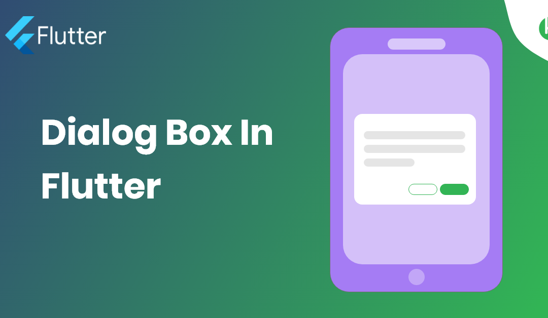
Dialog Box is a commonly used UI component in Flutter that is used to display important information or prompts to the user. It is a pop-up window that appears on top of the current screen and requires the user to take some action. In this blog post, we will explore the basics of using AlertDialog in Flutter and show you how to create and customize it for your app.

The first step in creating an AlertDialog in Flutter is to call the showDialog function, which takes a context argument and a builder function that returns the AlertDialog widget. For example:

showDialog(
  context: context,
  builder: (BuildContext context) {
    return AlertDialog(
      title: Text('Alert Dialog Title'),
      content: Text('This is the content of the alert dialog'),
      actions: [
        FlatButton(
          child: Text('OK'),
          onPressed: () {
            Navigator.of(context).pop();
          },
        ),
      ],
    );
  },
);

In the above example, we are creating an AlertDialog with a title, content, and an action. The actions property is used to specify the buttons that will be displayed at the bottom of the alert dialog. You can add as many actions as you like, but it is recommended to limit the number of actions to two.

You can also customize the appearance of the AlertDialog by changing its title, content, backgroundColor, and other properties. For example:

AlertDialog(
  title: Text('Alert Dialog Title'),
  content: Text('This is the content of the alert dialog'),
  backgroundColor: Colors.blue,
  shape: RoundedRectangleBorder(
    borderRadius: BorderRadius.circular(10.0),
  ),
  actions: [
    FlatButton(
      child: Text('OK'),
      onPressed: () {
        Navigator.of(context).pop();
      },
    ),
  ],
);

In the above example, we are changing the background color of the AlertDialog to blue and giving it a rounded rectangle border with a 10.0 radius.

In conclusion, AlertDialog is a useful UI component in Flutter that allows you to display important information or prompts to the user. With the ability to customize its appearance and behavior, it makes it a great option for creating engaging and interactive experiences in your app.

You can have in detail information on the GridView widget in this official Flutter Widget Of The Week from Google Flutter Team.

A Quick Guide to Grid View In Flutter – Hupen Design

A Quick Guide to Grid View In Flutter – Hupen Design

A Quick Guide to Grid View In Flutter – Hupen Design
Published At By Hupen Pun

Grid View in Flutter is a powerful way to create a visually appealing and interactive layout for your app. With the GridView widget, you can easily create a grid layout and populate it with widgets, images, or other elements. In this blog post, we will explore the basics of using GridView in Flutter and show you how to create a simple grid layout for your app.

The first step in creating a GridView in Flutter is to add the GridView widget to your app’s layout. You can do this by using the child property of the Container widget. For example:

Container(
  child: GridView.count(
    crossAxisCount: 2,
    children: [
      Container(
        color: Colors.red,
        child: Text('Item 1'),
      ),
      Container(
        color: Colors.green,
        child: Text('Item 2'),
      ),
      Container(
        color: Colors.blue,
        child: Text('Item 3'),
      ),
    ],
  ),
)

In the above example, we are using the GridView.count constructor to create a grid layout with 2 columns. The children property is used to specify the widgets that will be displayed in the grid.

Another important property of the GridView widget is the crossAxisCount property, which specifies the number of columns in the grid. You can also use the mainAxisSpacing and crossAxisSpacing properties to add spacing between the items in the grid.

Additionally, GridView allows to use .builder constructor in order to build the grid on demand, which is useful when dealing with large data sets.

GridView.builder(
    itemCount: 100,
    gridDelegate: SliverGridDelegateWithFixedCrossAxisCount(
        crossAxisCount: 2),
    itemBuilder: (BuildContext context, int index) {
      return Container(
        color: Colors.red,
        child: Text('Item $index'),
      );
    },
  ),

In the above example, we are using the GridView.builder constructor to create a grid layout with 100 items. The itemBuilder callback is used to generate the widgets that will be displayed in the grid.

In conclusion, GridView in Flutter is a powerful and flexible way to create grid layouts for your app. With the ability to control the number of columns, spacing, and the ability to build grid on demand, it makes it a great option for creating visually appealing and interactive layouts.

You can have in detail information on the GridView widget in this official Flutter Widget Of The Week from Google Flutter Team.